Introducing In-Context Analytics in Studio#
The Design, Product, and Engineering Teams from Schema Education, OpenCraft, and Axim Collaborative are excited to introduce In-Context Analytics to Open edX Studio. The primary goal of this feature is to equip busy course delivery teams with the data they need to make informed revisions to courses right where they edit course content.
In-Context Analytics introduces a new frontend plugin slot that can be used with Aspects, customized to display metrics from other systems, or disabled (the default). Instance Operators wanting to learn more about how to set up In-Context Analytics for their instance should see Configure Aspects for Production.
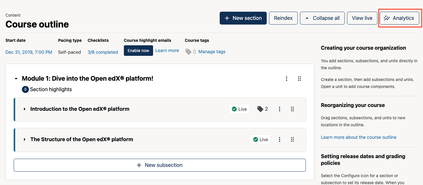
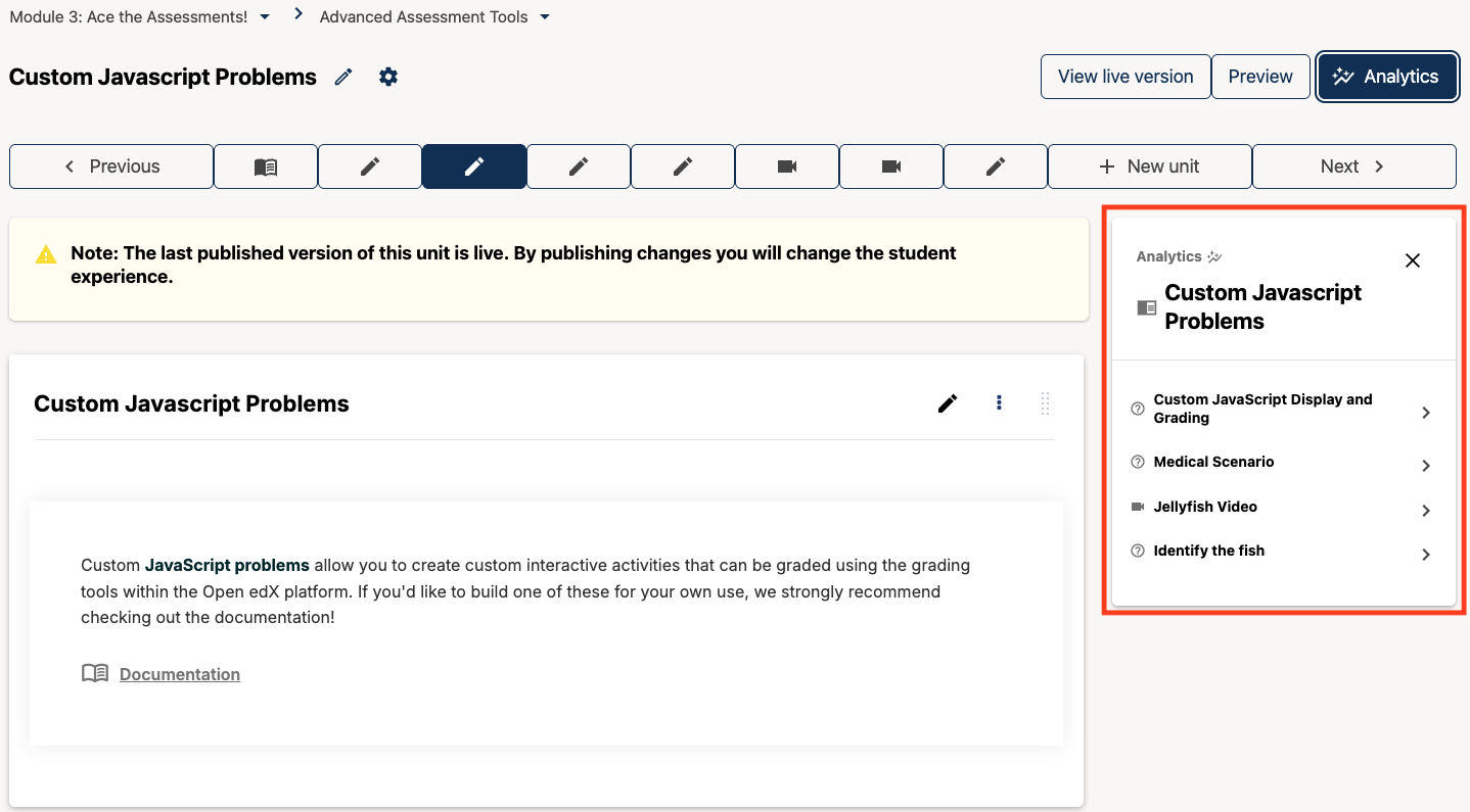
When enabled, users will see a new Analytics button at the top of the page on Course Outline and Unit pages.
Clicking the Analytics button opens an easy-to-access, easy-to-collapse sidebar in Studio that displays content engagement and performance data alongside the course outline, problem, and video components.
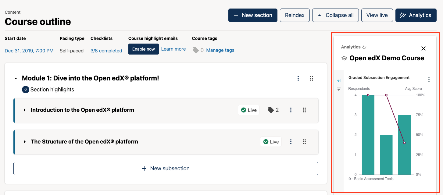
High-level Course Engagement Analytics#
The In-Context Analytics sidebar on the Course Outline page provides high-level insight into how learners are engaging with graded subsections, problems, and videos throughout the course.
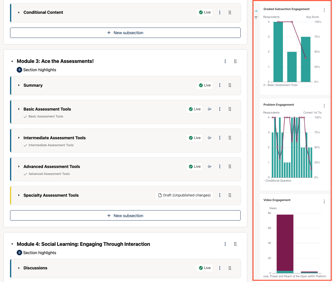
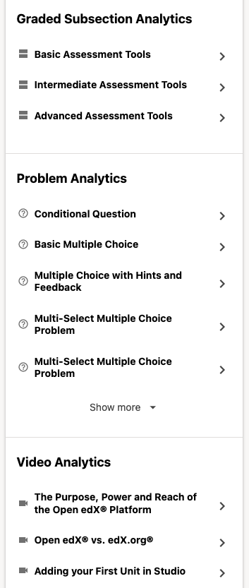
Course delivery teams can easily drill in to view more detailed data about a single graded subsection, problem, or video by selecting the subsection or component of interest from the menu beneath the engagement charts.
Component Engagement and Performance Analytics#
In comparison to the analytics provided on the Course Outline page, the In-Context Analytics sidebar on the Unit page provides more granular insight into how learners are engaging with a single course component at a time. From the sidebar, users simply click on the component they want to view more information about to see more detailed data for that component.
Problem Analytics#
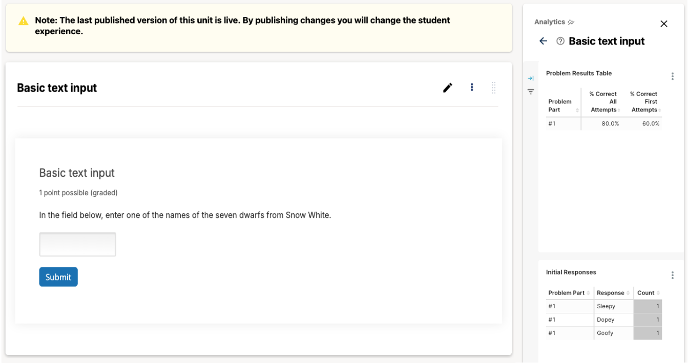
For problem components, the In-Context Analytics sidebar shows the percentage of correct responses on the first problem attempt and on all problem attempts. The percentage of correct problem responses on the first attempt is a good indicator of how difficult the problem is for the learners that submitted a response for the problem. It is a good indicator of whether or not a learner immediately understands the question being asked and can identify the correct answer to the question. The percentage correct on all problem attempts is an indicator of how well learners were able to recover from earlier incorrect responses. A higher percentage correct out of all problem attempts indicates that the learner is able to figure out the right answer with additional effort or hints. If this percentage is still low, the problem may be too difficult or confusing for learners.
The second table provides a breakdown of initial responses for each individual problem. The idea is to give course delivery teams a peak into learners’ thought processes when they approached the problem for the first time. This breakdown can give course authors quick insights into exactly how learners are getting a problem wrong, especially for difficult problems. This data can point to course delivery teams to where learners are getting mixed up.
Video Analytics#
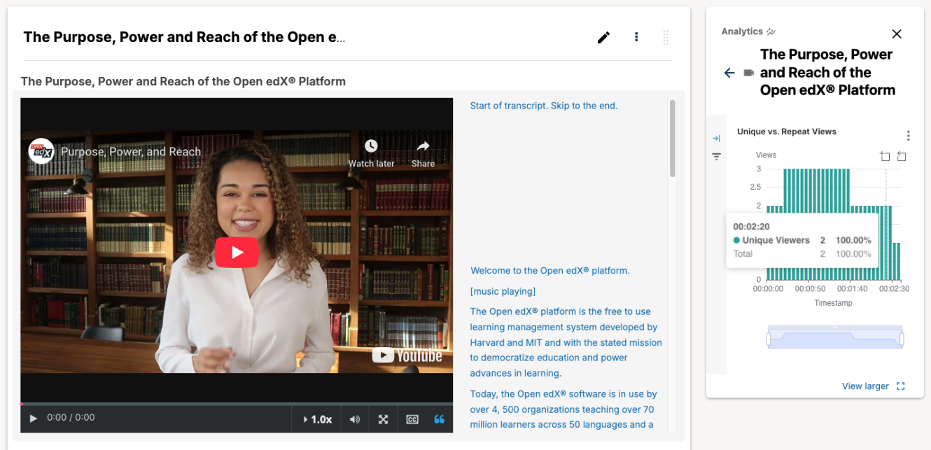
For video components, the In-Context Analytics sidebar displays the number of unique and repeat views for a single video by timestamp across the duration of the video. Timestamp ranges with a large number of repeat views should be reviewed as this might be an indicator that this particular section of video is unclear to learners.
For more detailed information about each of the charts and tables provided out-of-the-box, please visit In-Context Dashboards.
Maintenance chart
Review Date |
Working Group Reviewer |
Release |
Test situation |
2025-06-06 |
Data WG |
Teak |
Pass |